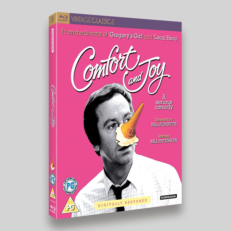
Comfort and Joy wasn’t a film I was familiar with when I was sent the assets to work on. But when I saw the original artwork of a man with an ice cream on his face and I knew I couldn’t go far wrong! The original poster used different colours, but we wanted to use a nice strong colour for the background. We initially tried red, but I colour matched a pink from a corrupted tiff file and we went with that, sometimes it’s the happy accidents that work.
The typographic treatment for the title is the original version, it just needed tweaking to work with the image, the ‘and Joy’ is slightly offset to the right. It was lovely working with something like that, script typefaces have become much more favourable recently, but it’s nice to work on an original.
This is part of StudioCanal’s Vintage Classics, but the most contemporary one I’ve worked on (begs the question how ‘old’ does something need to be to be classed as vintage, but more worryingly how old does it make me feel? Answers on a postcard please… A: before 1984 and very!).
Comfort and Joy features Bill Paterson and is directed by Bill Forsyth.
- Comfort and Joy DVD O-ring Packaging
- Comfort and Joy Blu-ray O-ring Packaging


