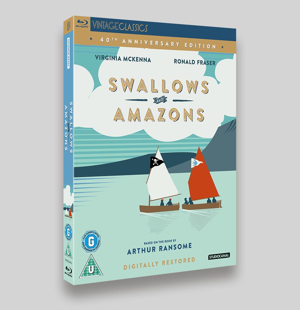
Another Vintage Classics sleeve for StudioCanal, Swallows and Amazons is the 1974 film adaptation of Arthur Ransome’s novel. Set in the 1920s, the story tells the tale of four children and their adventures on board their boat, the Swallow, whilst on holiday with their mother in the Lake District.
The brief was to modernise the existing sleeve (it should still be on Amazon here). I wanted to ignore the existing sleeve’s use of the 1970s Arnold Bocklin title treatment and used opted for the more relevant Brandon Printed typeface as a basis. Inspired by type from the 1920s, this seemed a perfect choice. I’m a sucker for the flat colour posters from the 1910s and 1920s, so I thought this would be a perfect opportunity to do something similar, considering the time period in which the film is set. I loosely traced the images of the children in the boats from the old archive shots and adapted another image for the background lake and hills. Up until the 11th hour there was a slight dirty feel to the sleeve, to increase the retro feel, you can still se this effect on the Amazon pack shots here. The sleeve was adapted for O-ring versions of the DVD and Blu-ray sleeves and features a Pantone gold (as consistent with other Vintage Classics).
The sleeves mark the 40th Anniversary of the theatrical release and are available on August 4th.
- Blu-ray O-ring sleeve
- Blu-ray sleeve
- DVD O-ring sleeve
- DVD sleeve


